
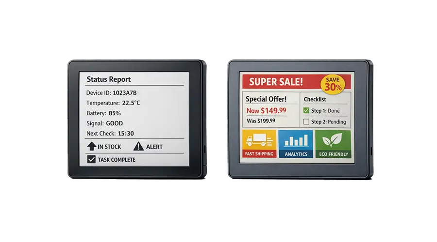
Choosing between black and white E-Paper and color E-Paper may seem simple at first, but in real product development it can affect power strategy, readability, cost, user experience, and long-term deployment success. Different projects prioritize different things. Some need the clearest possible presentation of essential information with minimal power use. Others need stronger visual communication, category highlighting, or more attractive public-facing display content.
This comparison matters for product designers, engineers, OEM teams, and buyers because the best display option depends on the actual application rather than on specifications alone. In this guide, we will compare monochrome vs color E-Paper in terms of visual presentation, refresh behavior, power considerations, cost, and industry fit, so you can choose the right E-Paper display solution for your project.
What Is Black and White E-Paper?
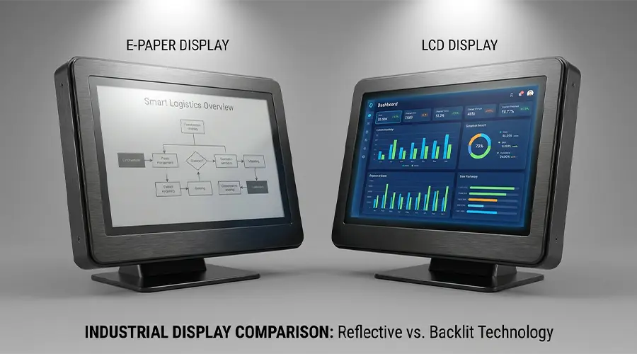
Black and white E-Paper, also called monochrome E-Paper, is a reflective display technology designed for clear presentation of text, numbers, symbols, codes, and basic graphics. It uses ambient light instead of relying on a conventional backlight, which helps create a paper-like viewing experience and strong readability in bright conditions.
One of the main strengths of black and white E-Paper is contrast simplicity. Because the screen focuses on essential visual output rather than expanded color communication, it is often very effective for clean information display. This makes it a practical choice for products where users need immediate readability rather than decorative presentation.
Common deployment scenarios include electronic shelf labels, industrial status indicators, warehouse tags, smart labels, healthcare information panels, and battery-powered devices that display mostly static content. In these use cases, clarity and power efficiency usually matter more than advanced visual styling.

What Is Color E-Paper?
Color E-Paper builds on the same low-power reflective display concept but adds expanded visual expression through multiple colors. Instead of showing information only in black and white, it can introduce highlighted content zones, category markers, warning signals, promotional emphasis, or richer layout presentation.
The practical value of color E-Paper is not only aesthetic. In many applications, color helps users identify priorities faster, distinguish content types more easily, and engage more effectively with the displayed information. This can improve communication in retail, office signage, healthcare labeling, and public information systems.
Typical application scenarios include promotional electronic shelf labels, meeting room signage, public notices, branded display panels, product information tags, and selected OEM interfaces where low power and stronger visual hierarchy need to coexist.
Core Differences Between Black and White and Color E-Paper
The difference between black and white and color E-Paper is not just about appearance. It also affects how information is structured, how the product is perceived, and how the display fits the system and business goals.
| Factor | Black and White E-Paper | Color E-Paper |
|---|---|---|
| Visual Presentation | Simple, clean, high-contrast information display | Richer presentation with highlighted elements and stronger hierarchy |
| Information Hierarchy | Relies on layout and typography | Uses color to improve category distinction and emphasis |
| Power Considerations | Often highly efficient for static content | Still low power, but may involve more complex update behavior depending on panel design |
| Refresh Behavior | Suitable for static or low-refresh content | Also best for static or periodic updates, with selection depending on content expectations |
| Cost and Complexity | Often simpler and more cost-effective for essential information display | Usually higher in display complexity and project cost due to color capability |
| Content Suitability | Best for text, numbers, status labels, and straightforward information | Better for promotions, branded content, coded information, and stronger user communication |
Simple selection principle: Choose black and white when clarity, efficiency, and essential information matter most. Choose color when visual hierarchy and communication value are equally important.
Advantages of Black and White E-Paper
Simplicity
Black and white E-Paper keeps the visual interface simple. This can be a major advantage in operational products where users need to understand information immediately without distraction.
Strong Readability
High-contrast presentation is often easier to read for text-heavy and status-focused content. In labels, data panels, and industrial indicators, this type of clarity supports practical day-to-day use.
Efficient Static Display
Monochrome E-Paper is especially effective for information that changes infrequently. It is a strong solution for battery-sensitive deployments where the content remains stable for long periods.
Suitable for Text, Numbers, and Status Indicators
If the main job of the display is to show prices, IDs, process states, schedules, codes, or simple instructions, black and white E-Paper is often the most direct and efficient option.
Advantages of Color E-Paper
Better Visual Differentiation
Color makes it easier to separate information categories, highlight important messages, and guide user attention. This is particularly useful when the display contains multiple types of content.
Enhanced Branding and Merchandising
In commercial settings, color E-Paper can support a more branded and attractive presentation. Retail labels, product cards, and promotional signage can benefit from stronger visual expression while still maintaining low power characteristics.
More Attractive Signage and Labeling
Compared with monochrome screens, color E-Paper can make office signs, public information panels, and smart display surfaces feel more modern and engaging. This is especially valuable for user-facing environments.
Improved User Communication for Selected Use Cases
In healthcare, public guidance, office scheduling, and promotional messaging, color can improve comprehension by helping users identify urgency, category, or status faster than layout alone.
When to Choose Black and White E-Paper
Black and white E-Paper is usually the better choice when the project prioritizes essential information, minimal complexity, and long battery life.
Industrial Instruments
Industrial products often need clear status data, warnings, IDs, or numeric information rather than rich visual communication. In these cases, monochrome E-Paper offers strong functional value.
Simple Electronic Labels
For straightforward pricing, identification, location, or inventory labels, black and white E-Paper is often sufficient and efficient.
Battery-Sensitive Applications
When battery service intervals and low-power operation are critical, a simpler monochrome display may be the most practical choice, especially if color adds limited user benefit.
Projects Focused on Essential Information Only
If the content does not need promotional emphasis, category coding, or branded visual layers, black and white E-Paper can deliver everything the project needs with less complexity.
When to Choose Color E-Paper
Color E-Paper is usually the better option when communication quality and visual distinction are important parts of the project’s value.
Promotional Retail Labels
Retail promotions, membership pricing, discount markers, and special campaign labels benefit greatly from color because it improves attention and category recognition.
Smart Office Displays
Meeting room signs, department panels, visitor guidance labels, and scheduling displays can use color to communicate status and structure more clearly.
Public-Facing Product Information
If the display is visible to customers, visitors, or the general public, color often creates a more engaging and easier-to-understand information surface.
Applications Requiring Emphasis and Category Coding
In use cases where users must quickly distinguish product classes, warning levels, scheduling states, or functional groups, color can create practical value beyond appearance alone.

Cost, Integration, and Project Planning
The right decision between black and white and color E-Paper should include more than display appearance. Budget, system integration, content design, and long-term operating plans also need to be considered.
Budget Implications
Black and white E-Paper is often the more cost-efficient solution for simple applications. Color E-Paper may involve higher module cost and more careful application matching, so the decision should be based on whether the additional communication value justifies the investment.
Content Design Strategy
Teams should think about how the content will be created and maintained. If the design only uses basic text and numbers, monochrome may be enough. If the layout depends on highlighted states, visual emphasis, or branded structure, color may provide better long-term value.
Module Selection and System Support
Display selection should include controller support, update logic, software compatibility, mechanical fit, and front-surface design. In custom or OEM projects, these integration details matter just as much as the display category itself.
Long-Term Operational Considerations
Large deployments should evaluate maintenance requirements, consistency of content presentation, device lifecycle, and replacement strategy. A simpler display may reduce operational complexity, while a richer display may improve communication efficiency at scale.
Which Option Is Better for Your Industry?
The best option often depends on the industry and the role the display plays within it.
Retail
Retail often benefits from both types. Black and white E-Paper works well for standard price labels, while color E-Paper is better for promotions, category distinction, and enhanced shelf communication.
Logistics
Logistics environments usually prioritize clarity, durability, and essential information. Black and white E-Paper is often a strong fit unless color coding adds clear operational value.
Industrial
Industrial products often focus on status, process information, and usability under practical working conditions. Monochrome displays are commonly suitable, but color may help where warnings, categories, or process roles need stronger differentiation.
Healthcare
Healthcare can benefit from either type depending on the use case. Black and white works well for clean patient information or equipment labels, while color can improve quick recognition of status or category-based information.
Office Environments
Office signage and booking systems often gain value from color because availability, scheduling state, or department grouping can be communicated more clearly with visual emphasis.

Conclusion
Black and white E-Paper and color E-Paper each solve different problems. Black and white is usually the stronger option for clarity, efficiency, essential information display, and battery-sensitive deployments. Color is the better option when richer communication, stronger emphasis, and more attractive user-facing presentation are important to the application.
The best way to choose is to start with the actual project goal. If the display only needs to present simple content as clearly and efficiently as possible, black and white is often ideal. If the display must also support visual hierarchy, branding, or category differentiation, color may deliver better results. Matching the display type to the real use case will lead to a better product and a more effective deployment.
Need Help Choosing Between Black and White and Color E-Paper?
If you are comparing E-Paper options for retail, logistics, industrial, healthcare, office, or OEM applications, you can build internal links here to your related category pages or inquiry page.
Suggested internal links: Black and White E-Paper / Color E-Paper / E-Paper Collection / Custom E-Paper Modules / Contact Us
FAQ
Is black and white E-Paper more power efficient?
In many applications, black and white E-Paper is considered highly power efficient because it is optimized for simple static content. Actual power behavior depends on the specific panel and update pattern, but monochrome solutions are often preferred for battery-sensitive projects focused on essential information.
Is color E-Paper easier to read?
It depends on the content. Black and white E-Paper often provides excellent readability for text and basic information because of its clean contrast. Color E-Paper can improve readability when category distinction, highlighting, or visual hierarchy helps users understand the information more quickly.
Which option is better for ESL?
Both can work well for electronic shelf labels. Black and white E-Paper is suitable for standard pricing and basic product information, while color E-Paper is better when the retailer wants to highlight promotions, discounts, or product categories more clearly.
Does color E-Paper cost more?
In many cases, color E-Paper involves higher cost and greater project complexity than black and white E-Paper because of its expanded visual capability. Whether that extra cost is worthwhile depends on how much value the application gains from color-based communication.
Can both be customized for OEM projects?
Yes. Both black and white and color E-Paper displays can be adapted for OEM and custom module projects depending on size, resolution, interface, front-surface design, mounting requirements, and application goals. The right choice depends on the product structure and intended use case.
How do I choose the right E-Paper type for my product?
Start by reviewing what the display needs to communicate, how often the content changes, whether color adds practical value, how sensitive the product is to power consumption, and what kind of user experience the project requires. The best choice is the one that matches the real information task.

댓글 남기기
이 사이트는 hCaptcha에 의해 보호되며, hCaptcha의 개인 정보 보호 정책 과 서비스 약관 이 적용됩니다.